A visual system created to represent the balance between nature, technology, and science. This project was developed for the research group led by Dr. Meng Zhao at the University of Idaho, which investigates the relationship between hydrology, ecology, and sustainability.
“We are a young and growing group. We study the intersection between hydrology and ecology, and their broader implications on climate, society, and policy making.
We employ a variety of approaches, including satellite remote sensing, GIS (geographic information systems), Earth system modeling, and machine learning.
We aim to use what we discover to address challenges in the water-energy-food nexus.”
Dr. Meng Zhao
The challenge
The group needed a clear and versatile visual identity that would reflect the intersection of nature, innovation, and applied science. The goal was to translate complex concepts into a visual language that is accessible and meaningful.
The solution
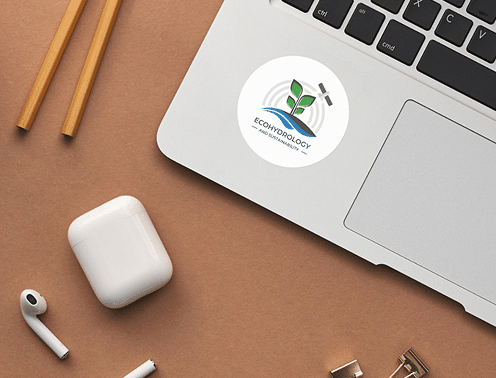
The design combines organic and geometric shapes, representing the group’s core pillars:
Soil and vegetation
Hydrology and water cycles
Data-driven sustainability
Remote sensing and environmental modeling
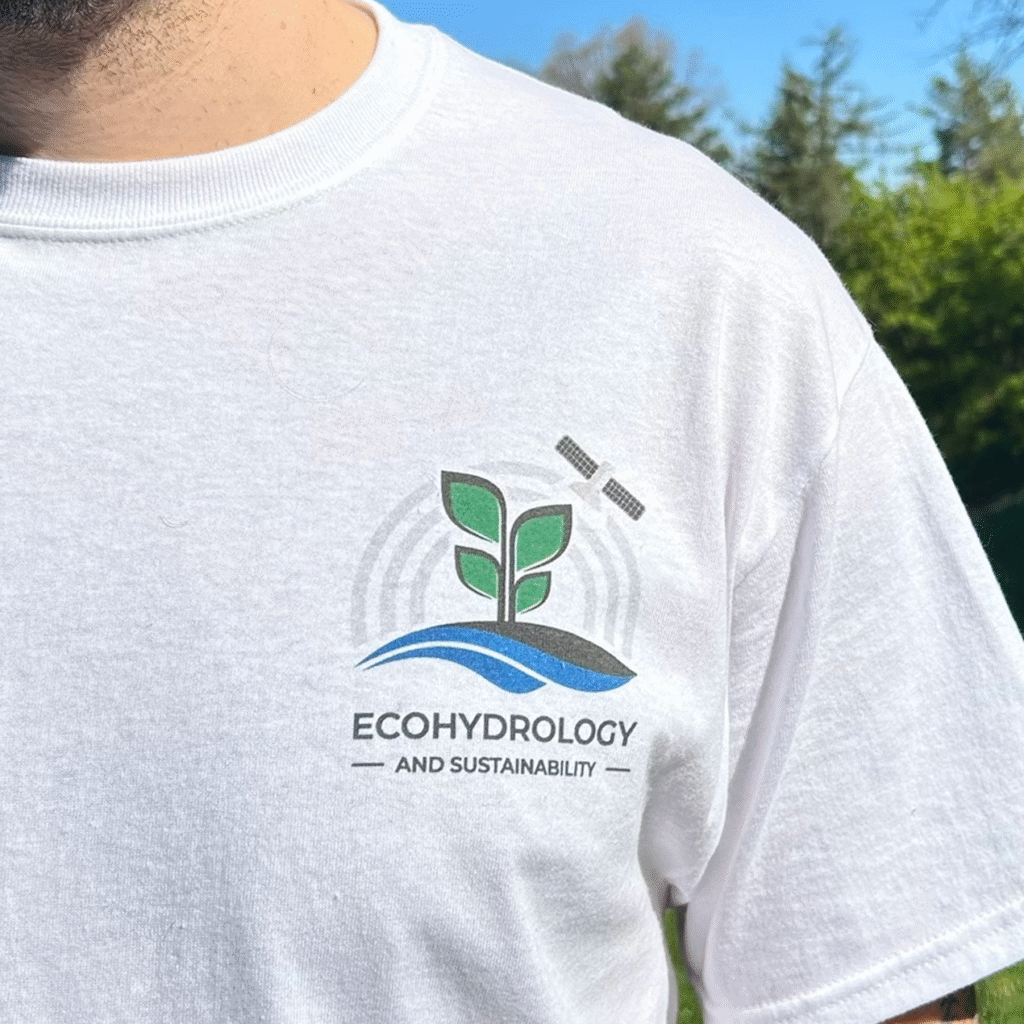
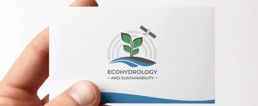
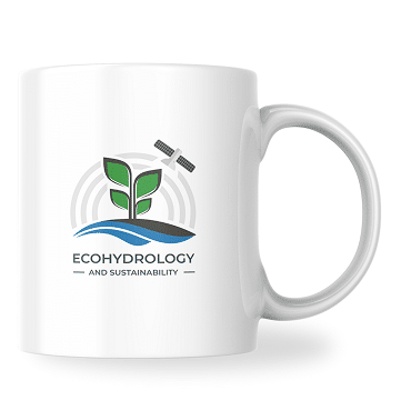
At the center of the logo, a plant emerges from the ground. Blue waves represent water systems. White arcs reference satellite signals and computational modeling.
The solution
The design combines organic and geometric shapes, representing the group’s core pillars:
Soil and vegetation
Hydrology and water cycles
Data-driven sustainability
Remote sensing and environmental modeling
At the center of the logo, a plant emerges from the ground. Blue waves represent water systems. White arcs reference satellite signals and computational modeling.
Creative process
Turning ideas into visuals starts with deep listening
Concept and structure
The central idea was to portray the connection between nature and technology. Each visual element directly reflects the group’s research themes.
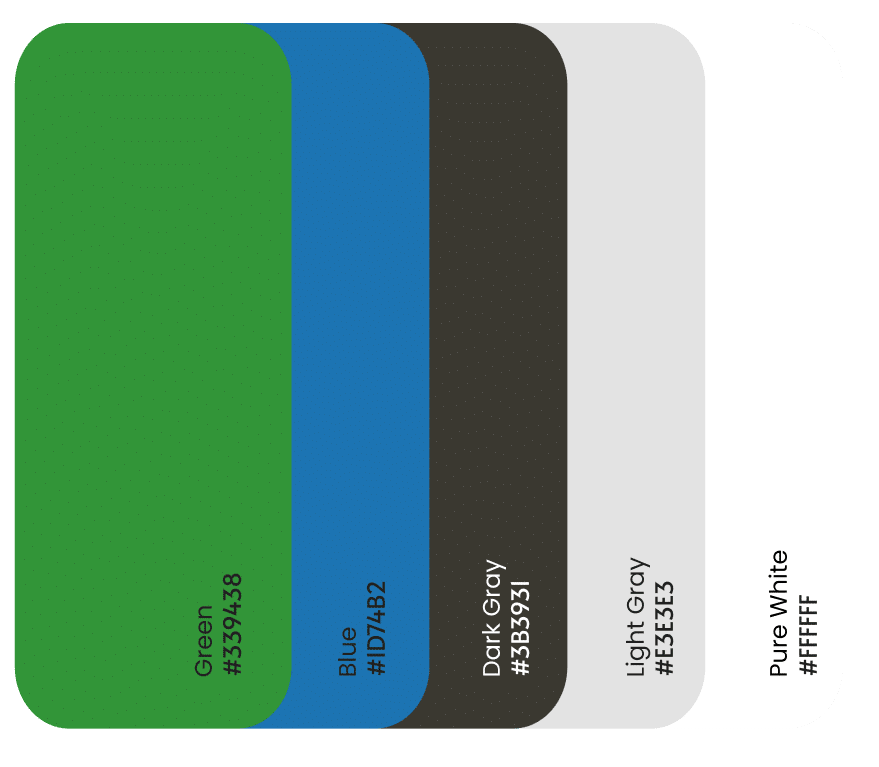
Color palette
Shades of green, blue, and gray balance nature and science, echoing the environments studied: vegetation, soil, water, and atmosphere.
Typography
The Montserrat typeface was chosen for its clarity, modernity, and adaptability across various formats.
Versatile applications
The logo was delivered with usage guidelines and variations for presentations, documents, digital platforms, and print materials.
Colors and typography that reflect both nature and science.
A balance between nature, science, and technology
Outcomes and learnings
Developing a clear briefing questionnaire was essential to align expectations
Detailed responses and the group's engagement made the process collaborative and efficient
Translating scientific themes into a visual identity required listening, synthesis, and sensitivity
The brand was well-received and benefited from valuable feedback from Dr. Meng during the final stages
This project was an exercise in bridging science and design. The visual identity of the Ecohydrology and Sustainability group was born from actively listening to the researchers' needs and the desire to transform technical knowledge into visuals with meaning and purpose.
This project was an exercise in bridging science and design. The visual identity of the Ecohydrology and Sustainability group was born from actively listening to the researchers' needs and the desire to transform technical knowledge into visuals with meaning and purpose.